
Document scanning
As the main Product Designer at ConnectedCare, I led the design and delivery of a document scanning feature for the Patient App—enabling hospitals to streamline admissions while reducing patient stress. Working within tight technical constraints, I balanced business requirements, user needs, and engineering feasibility to deliver an MVP that achieved 90% task completion and positive feedback from both hospitals and patients.
My responsibilities during this project:
- Leading end-to-end design strategy from discovery through delivery
- Conducting competitive analysis and synthesizing user research to inform requirements
- Collaborating with Product and Engineering to further define MVP scope and technical constraints
- Designing and validating user flows, wireframes, and high-fidelity prototypes
- Facilitating stakeholder alignment across clinical, technical, and business teams
- Advocating for validation practices within timeline and budget constraints
- Company: BEWATEC ConnectedCare
- Role: Product Designer
- Timeline: June 2021
- Team: PM, Product Designer, Development Squad, UX Researcher
Context & Problem
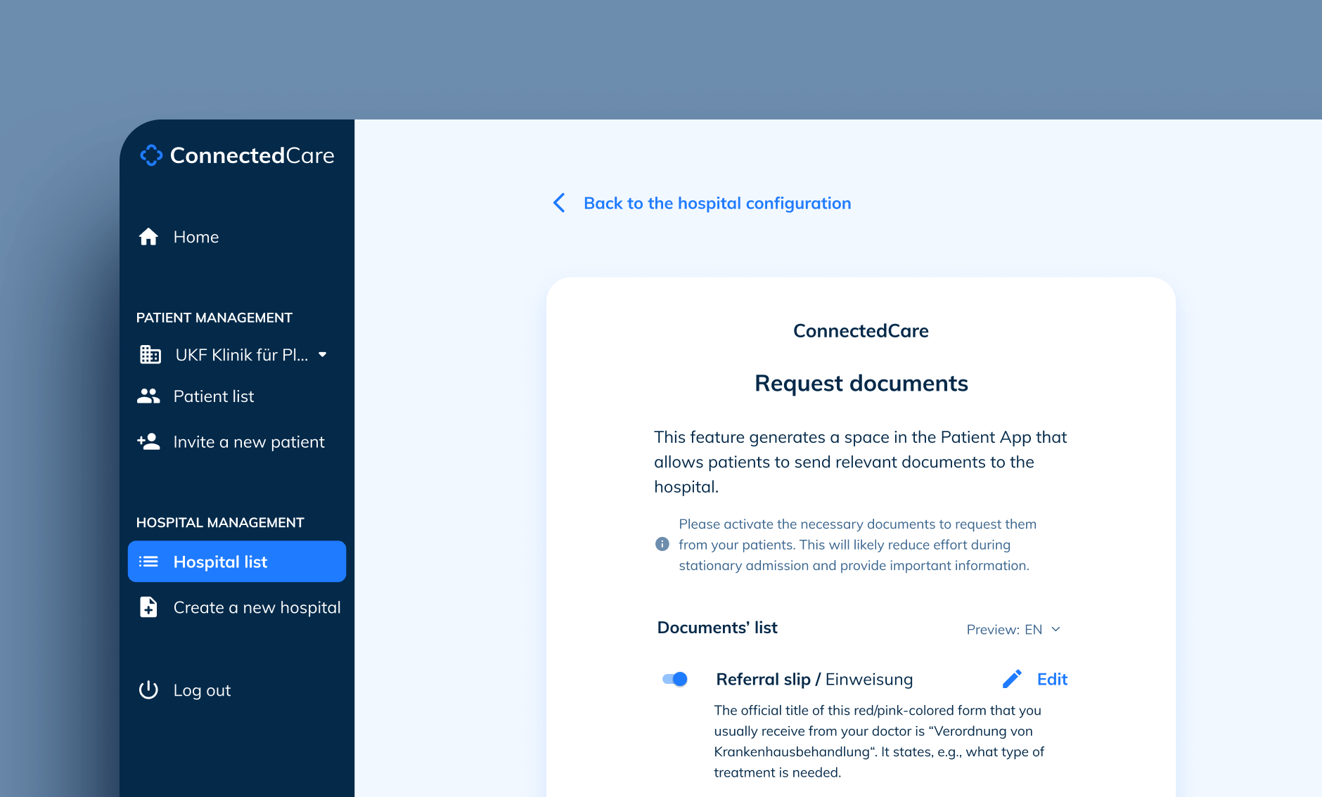
During the admission phase, many hospitals required patients to bring extensive paperwork, creating bottlenecks and stress for everyone involved. I designed a solution that allowed hospitals to request documents in advance, enabling patients to scan and submit everything through the app before their appointment.
Initial MVP Requirements:
- Avoid 3rd party integrations
- Create a "Document sending" entry point in the App
- Patients must take an instant picture to avoid corrupted files
- Patients cannot delete any requested document
- Possibility to edit a document scan before sending it
- Patients forward each file separately
- Patients can send documents at any moment
- After the upload, users see a timestamp confirmation
- After the sending, changes aren't possible
User Insights
To inform design decisions, I synthesized insights from multiple research sources: user interviews, usability tests, patient surveys, and direct hospital feedback. This research identified two critical user segments with distinct needs and stress points:

1. JACK BURNS - Experienced Patient
Context: Pre-hospital admission in a couple of months, chronic condition, privately insured
Key Insights:
- Manages constant medical processes due to chronic condition
- Wants to complete administrative tasks quickly and move on
- Trusts medical professionals and follows instructions
- Values efficiency over detailed information

2. CECILE TONE - First-Time Surgery Patient
Context: Scheduled surgery in a few days, publicly insured, first major medical procedure
Key Insights:
- Needs clear guidance to reduce anxiety about unfamiliar process
- If possible, wants to prepare everything ahead of time
- Highly organized and proactive with health management
- Seeks detailed information to feel in control
Competitive Analysis & Design Decisions
I conducted competitive analysis to understand how users interact with document scanning tools and to identify industry standards. Most applications featured automatic image recognition that trimmed and adjusted the final picture. They often allowed users to add and delete multiple pages as needed and sometimes permitted uploading existing images (however, we dismissed this last approach due to security concerns for hospital environments).

So, based on competitive analysis and the previous user research, I synthesised the key insights into a set of additional MVP requirements and aligned the team around these priorities to ensure feasibility and impact:
- Multi-page scanning functionality (scoped to Phase 2)
- Confirmation step before submission to prevent errors
- Clear, detailed document descriptions to reduce user confusion
- Reminders to support task completion prior to admission
- Flexible handling of optional vs. mandatory documents based on insurance type

One of my first strategic decisions was defining the feature’s entry point to ensure strong discoverability and long-term usability. The app’s homepage had three core categories (Appointments, Checklists, and the Admission Questionnaire). While there appeared to be space for a new category, I evaluated the following options:
- Proposal 1 — Use separate spaces for questionnaires and documents: Research indicated that hospitals would request multiple questionnaires depending on treatment type, and the initial brief required support for various document types. Creating distinct spaces would reduce cognitive load and keep each flow focused and scalable.
- Proposal 2 — Combine questionnaires and documents into a single space: While this approach would simplify the initial technical implementation, it risked creating a confusing experience, particularly given the lack of control over the number and type of documents hospitals could request.
Recommendation: I advocated for separating documents and questionnaires into distinct entry points. Although the combined approach appeared faster to build, the team aligned on the more scalable structure. This decision later proved effective as hospitals began requesting multiple questionnaires per treatment type.
Wireframes and Prototyping

I created interactive prototypes to facilitate alignment across stakeholders and provide engineering with clear implementation guidance, a practice I've found reduces miscommunication and speeds up development. The prototypes allowed us to run internal validation sessions before formal user testing. You can see the final prototype in Figma.
User Testing
I collaborated with our UX researcher to conduct user testing, which surfaced critical issues that informed design iterations:

Final Solution
The redesigned feature achieved 90% task completion among patients and received positive feedback from both hospitals and users, validating the design's usability and effectiveness in reducing admission stress.


What I Learned
This project taught me a few critical lessons. While we achieved positive outcomes, the process revealed opportunities for improvement that have since shaped how I approach design leadership.
- Validation: Testing after development slowed delivery and increased risk. Since this project, I've advocated for lightweight validation at the concept stage, even if just internal reviews or rapid prototype tests with 3-5 users. This approach has reduced costly late-stage changes in subsequent projects.
- UX advocacy: I recognized that designers must actively advocate for research practices, especially when timelines are tight. I've since developed frameworks for communicating the ROI of early testing to stakeholders, helping teams understand that validation prevents expensive rework rather than delaying delivery.
- Impact: We didn't establish success metrics until six months post-launch. I now ensure that success criteria and analytics are defined during discovery, enabling teams to measure impact immediately and iterate based on data.
- Adoption: Despite positive user feedback, this feature was only adopted by one clinic... an expensive lesson about validating market demand before committing resources. I've since incorporated market validation into my discovery process, helping teams assess both user need AND business viability before proceeding.
Related projects
-
See project →
Hospital Administration
Product design -
See project →
Ada Health Website
Visual design -

See project →
Replace SDS
Product design