Nursing school identity
During the pandemic, I participated in a logo contest for one of the main nursing associations in Mallorca (Spain). I had a few good friends who were in touch with this association and invited me to use my knowledge to help them with their branding and communication strategy.
Coiba (Col.legi Oficial d'Infermeria de les Illes Balears) is a group of care professionals committed to improving the nurse profession and the overall society. One of the things that they wanted to highlight in their new logo was their tireless work to promote high-quality healthcare, as well as to ensure basic principles of dignity, freedom, and equality for all men and women.
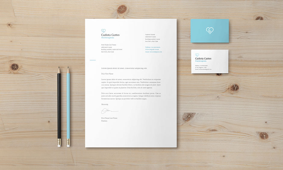
This project required the creation of a logo and a letterhead. For "bonus points", participants could also provide a rough idea of how their new website could look like.
- Project type: Contest
- Date: Winter, 2020
The logo concept
This proposal highlights the impact and the importance of nursing services in our society. In this logo we see how the united strength of all people becomes a balanced and functional engine of health.


The colors
Turquoise is a cheerful color that has been often associated with health services due to its calming and comforting effect. This color is also commonly linked to emotional balance and peace. Since both navy and turquoise have a blue tint in common, these two tones pair harmoniously, creating a very stable combination of lights and shadows that results in a pleasant effect on our eyes.


The typeface
Merriweather is a warm and pleasant typeface that, despite its traditional look, provides its users with highly readable texts on screes. This serif family offers a set of 8 weights and styles that make it very flexible and easy for its users to work with.


